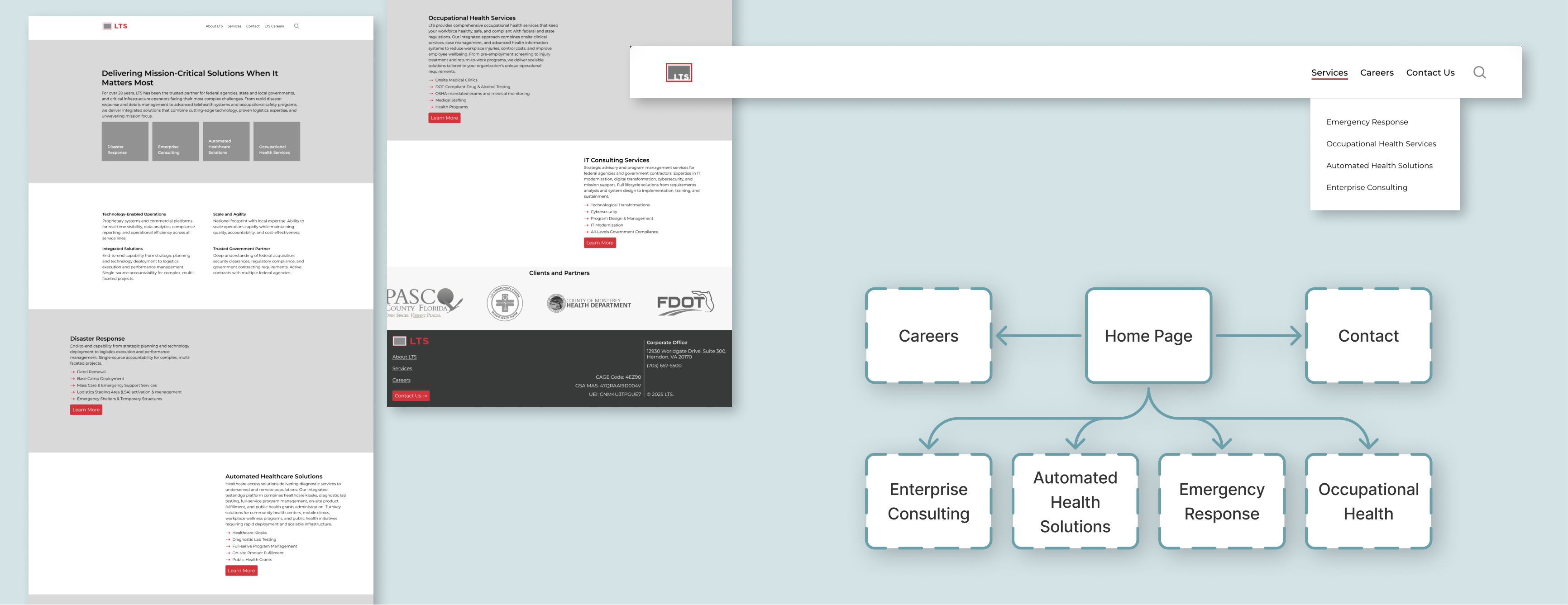
LTS's site was structured around Consulting, its original business, leaving Emergency Response, a fast-growing division actively pitching clients, effectively invisible online. A prospect gave direct negative feedback about Emergency Response's web presence during a high-stakes bid, which triggered a full end-to-end redesign that gave all four divisions distinct identities and restructured the site's IA around division-first navigation.
The site was losing them business
The original site led with Consulting and buried newer divisions, making it impossible for prospects to quickly identify the right service. During a high-stakes pitch, a prospect flagged directly that Emergency Response wasn't credibly represented, which made the problem concrete and urgent.
Division-first IA, one identity per team
The site was restructured so each of the four divisions leads with its own page and distinct visual identity, rather than being folded under a Consulting-centric navigation. Stakeholder interviews across every division and the C-suite aligned positioning and growth priorities before any design decisions were made.
Four divisions, one cohesive system
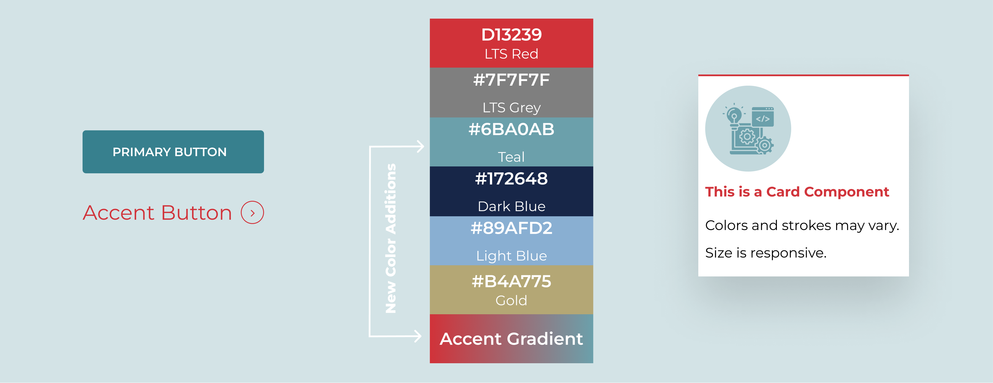
The rebuilt site expanded the brand palette from red and grey to four division-specific colors (teal, navy, gold, sky blue) with a unifying wavy section divider as a visual motif across all pages. A smart contact form replaced the shared email inbox, automatically routing each inquiry to the correct division team with no manual re-routing.