Building a Design System
The product experience spanned a kiosk app, reservation flow, and marketing website, but without a unified design system, component drift had made QA slow and inconsistent. I audited the existing style sheet, rebuilt the component library around atomic design principles and MUI, and introduced Storybook as a shared source of truth between design and development. The result was a scalable, validated system that reduced QA overhead and delivered a consistent experience across every touchpoint.
The Challenge
When Turnover Breaks Your System
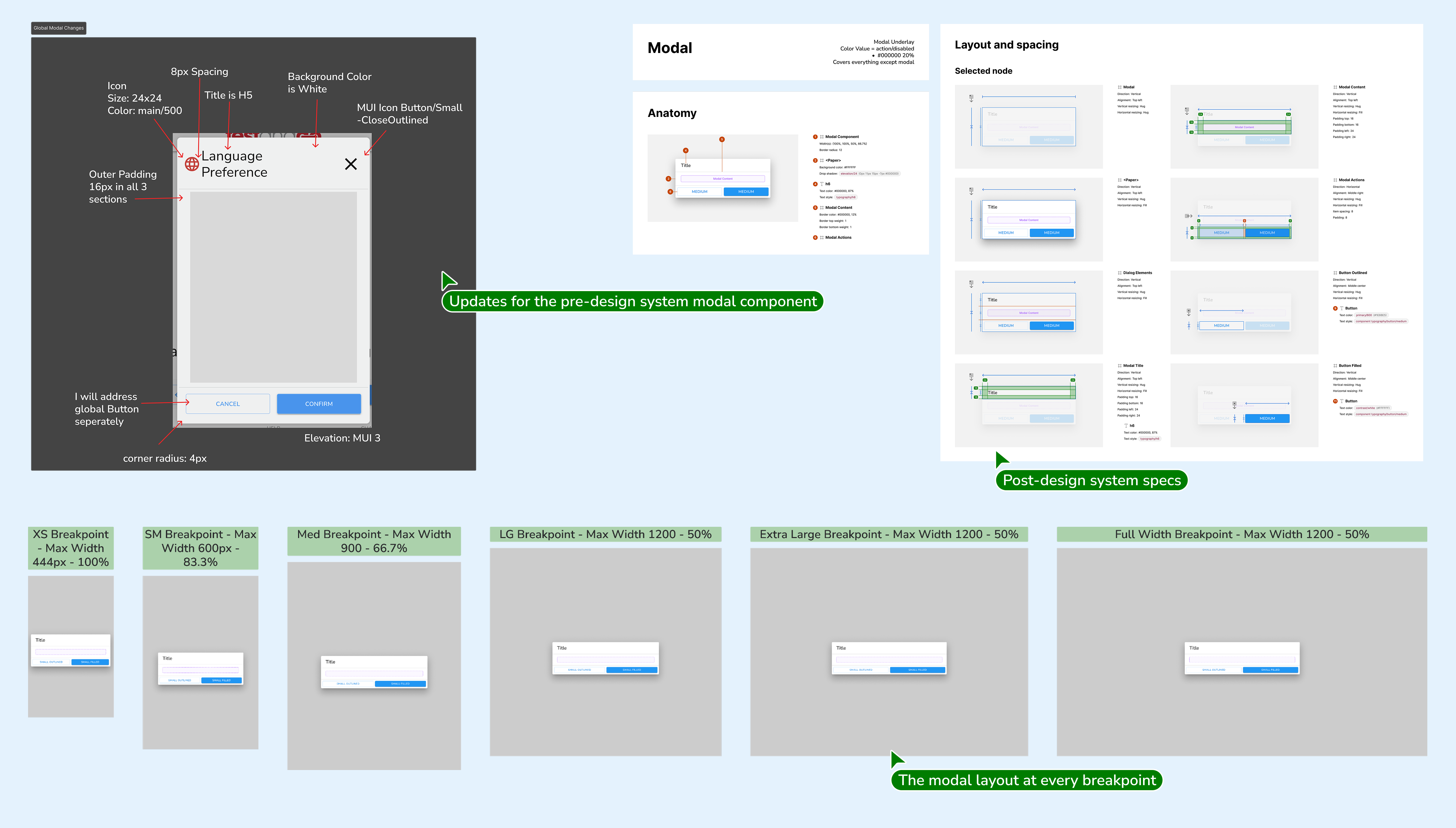
A core challenge was establishing consistent component standards through closer QA and communication with the development team. Turnover on the dev team had led to duplicative components and styles, making QA in the live environment complicated and time-consuming. Even with a careful process of inspecting, notating changes, and submitting tickets, loose instances of inconsistency still slipped through. Business operations were also discussing a larger screen size, prompting a shift to responsive design on the kiosk, including new breakpoints and page layouts. At the same time, we were expanding the reservation flow into the website experience, making a unified system more urgent than ever.
The Strategy
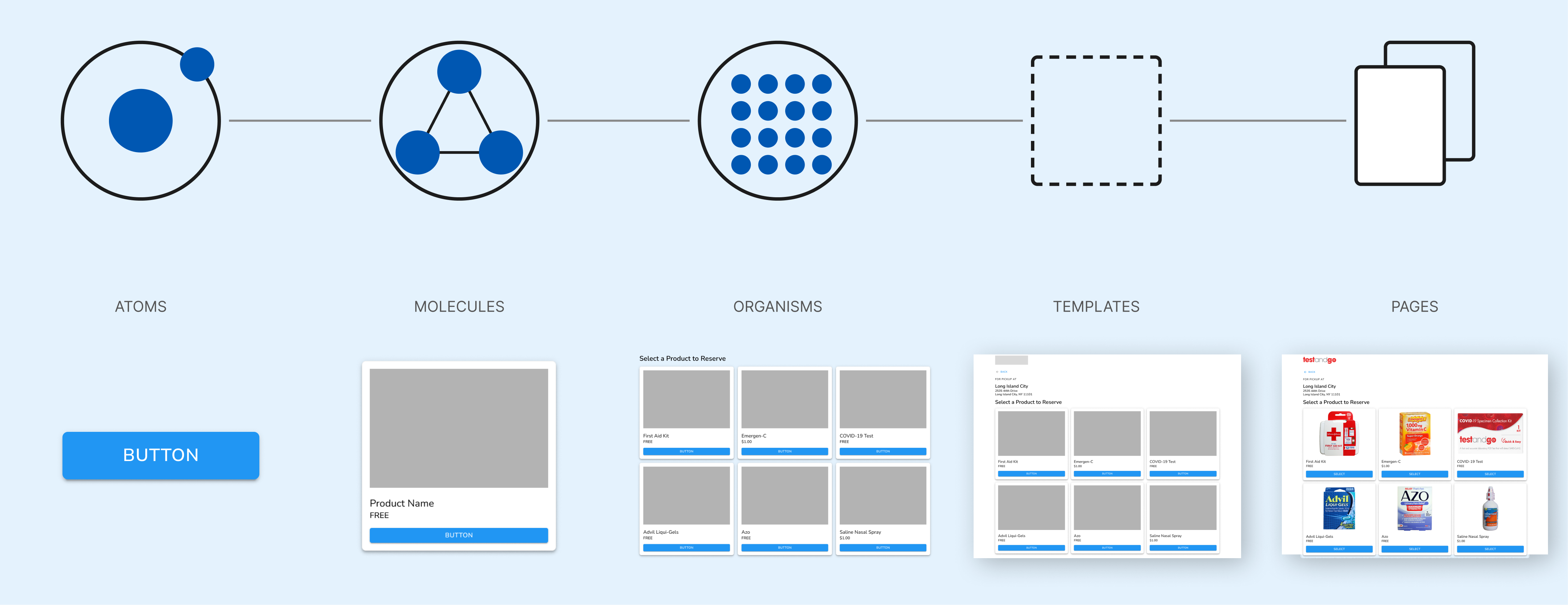
Atomic Design Meets Real-World Constraints
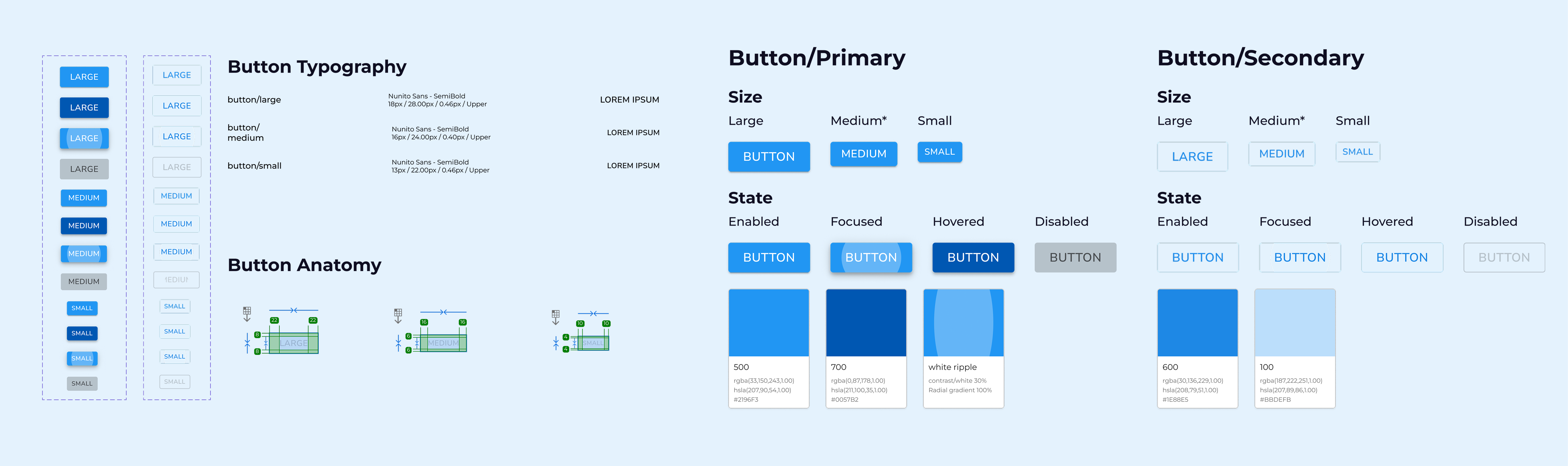
The approach was grounded in Brad Frost's atomic design methodology, using it as a framework to audit and restructure what already existed. I combed through the style sheet, annotated components, and mapped the clearest path to consolidating redundant styles. Collaborating with a new team member who brought deeper front-end experience, we leaned heavily into MUI since the developers were already building with its components. We trusted MUI's color and animation choices to meet best practices rather than overriding them, then retroactively replicated the system on the testandgo.com Wix site to unify the end-to-end experience.
The Solution
One Source of Truth
Bringing on a team member with a well-rounded front-end experience was a turning point, enabling us to introduce Storybook as a component-level QA environment and a shared reference between Figma and the live codebase. With text and color styles fully documented and easy to cross-reference, design-to-dev validation became faster and more reliable. After the recent launch of Claude Design, Storybook was no longer needed as a middleman, with the design system itself serving as the definitive reference.